
The author discusses the issue of ethnography-overuse. Many people are using ethnographies in their studies and aren't adhering to the traditional methods of doing them. They explain that doing things these ways could be more detrimental than they are beneficial.
Additionally, blindly following the results could lead to bad design. Instead, additional factors should be considered in order to determine what the best design for a given problem is. I thought this paper was a pretty tough read. It came across as more of a rant than anything.
Tuesday, May 12, 2009
Human-Centered Design Considered Harmful
I think it was what I expected to read. He seemed to back-track yet again. Now, he talks about how design should follow a more activity-centered philosophy instead of being human-centered. Human-centered design leads to very complex systems. Every suggestion is taken into account and the final product is continually modified and expanded until it is a giant mess. With activity-centered design, suggestions are evaluated in terms of the requirements of the activity. He explains, "The best way to satisfy users is sometimes to ignore them."
Design this way requires developers that know exactly what activity they are designing a product for. When developing, they should maintain an "I know what's best for you" attitude. Human-design ensures that the products work and they are usable by those that they are meant for. Following an activity-centered approach can lead to great design. This is where the innovative products come from. A clear concept of the end-product is kept in mind, and things that contradict it are thrown aside.
Design this way requires developers that know exactly what activity they are designing a product for. When developing, they should maintain an "I know what's best for you" attitude. Human-design ensures that the products work and they are usable by those that they are meant for. Following an activity-centered approach can lead to great design. This is where the innovative products come from. A clear concept of the end-product is kept in mind, and things that contradict it are thrown aside.
Usability Evaluation Considered Harmful
Main message- "The choice of evaluation methodology – if any – must arise from and be appropriate for the actual problem or research question under consideration."
They explain that researchers should first sit down and look over what they are trying to demonstrate in their experiment. Then, the method that best demonstrates this concept should be used. Some of these methods include usability studies, design critiques, design alternatives, case studies, cultural probes, reflection, design rationale, etc. They go on to explain that a combination of these methods is even more useful to prove your point.
I doubt this is just me... but this is completely obvious. I would like the 20 minutes of my life that I spent reading these 10 pages back please.
Fitts' Law
Equation:
Basically, the law predicts the time required to point to a specific area using any type of pointing device. Proposed in 1954, the idea has withstood the rigorous test of time. Additionally, it is able to be applied over a wide range of devices. It first applied to very simple pointing devices that were used in the 50's. Today, the same ideas still hold true to stylus devices on multi-touch screens. Unfortunately, there are many interfaces that are designed which completely ignore Fitt's Law.

Basically, the law predicts the time required to point to a specific area using any type of pointing device. Proposed in 1954, the idea has withstood the rigorous test of time. Additionally, it is able to be applied over a wide range of devices. It first applied to very simple pointing devices that were used in the 50's. Today, the same ideas still hold true to stylus devices on multi-touch screens. Unfortunately, there are many interfaces that are designed which completely ignore Fitt's Law.
Wednesday, April 29, 2009
Paper from CHI 2009
Comments:
Comment #1
Comment #2
Comment #3
Focus on Driving: How Cognitive Constraints Shape
the Adaptation of Strategy when Dialing while Driving
Duncan P. Brumby, Dario D. Salvucci, Andrew Howes
Link to CHI 2009 paper.
Overview:
As mobile devices become more common, more distracted drivers take to the roads. Over the years, studies have concluded that interacting with other people or devices while driving increases the risk of being involved in an accident. This results from the driver's need to perform multiple tasks at once--diverting their attention off of the road. These tasks must be interleaved together in order to accomplish them. This paper focuses on identifying the different methods people use to interleave concurrent tasks.
Experiment:
The experiment was conducted using a driving simulator. Subjects drove a vehicle down the center lane of the highway which was lined with construction cones on either side. The vehicle moved at a constant speed so the subjects only had to focus on keeping the vehicle in the center lane and dialing numbers on a cell phone. Key presses on the phone were recorded and timestamped.
In the first part of the experiment, participants were timed on how fast and accurately they could dial the number. Then, they interacted with the simulator, trying to keep the vehicle centered in the lane while traveling at a constant speed. In the second part of the experiment, subjects interleaved the tasks based on different priorities: dialing focus or steering focus.
Results:
 The data shows that when the subjects used their phones, their performance was impaired because their attention was focused on things other than driving. Improvements in lane keeping only occurred during long delays between key presses, and the vehicle moved further away from the lane center during shorter key press intervals. The duration of time between key presses can be used to determine when drivers were focusing their attention on the driving task.
They also saw that participants use hierarchical chunks to determine when they were to switch from one task to another (ex: xxx-xxx-xxxx). The experiment shows that they would break the dialing up into these chunks and lane keeping would improve during the period of time between these chunks.
 From here, they tried to determine which strategy of task interleaving would be most efficient in terms of driver performance. For this, they used a Cognitive Constraint Modeling (CCM) framework to explore alternate task interleaving strategies. They were able to derive performance predictions for each strategy that was implemented.
They found that drivers who didn't return their attention to the driving task at least twice experienced large lane deviation. Those who made a correction to steering after dialing the first chunk experienced less lane deviation while dialing the second chunk. Though it might have not been needed the first time, it decreased the amount of lane deviation they experienced in the future.
Conclusion:
Their findings support the idea that the total time a driver is distracted from their primary task is less important than the extent to which they glance back at the road while trying to complete the secondary task. Designing mobile devices that don't require long periods of interaction could be helpful in reducing the "deleterious effects of distraction."
Tuesday, March 24, 2009
Paper from UIST 2007
Comments:
Comment #1
Comment #2
Comment #3
LucidTouch: A See-Through Mobile Device
Daniel Wigdor, Clifton Forlines, Patrick Baudisch, John Barnwell, Chia Shen
Link to UIST 2007 paper and video.
Overview:
A potential drawback of touchscreen devices (on mobile phones) is that the user's fingers may obstruct his/her view of the screen or item they are selecting. This paper discusses a device (LucidTouch) that allows the user to control the application by touching the back of the device. This is done by overlaying an image of the user's hands onto the screen, making it appear that the device is semi-transparent. This allows users to easily select things on the screen that could otherwise potentially be obscured by their fingers or hands.
Device:
It combines a multi-touch input surface with a semi-transparent display that overlays an image of the user's hands onto the screen (illuminated semi-transparent bi-directional diffuser layer). It makes use of a camera mounted on the back of the device to capture video of the user's fingers and hands. Since there are eight possible contact points, something was needed to help users distinguish between fingers on the display. The LucidTouch makes use of red dots (hovering fingers) and blue dots (in contact with device).
Experiment Features:
The traditional QWERTY layout was used. Additionally, a modified version was also used that split the keyboard in half and reoriented it so that the user could maintain the usual "home row" while holding the device. While it might benefit touch typists, it could potentially be confusing for users who are unable to do this (look at keys when typing on a regular computer keyboard).
Since one finger can't span the entire screen space, coordinated actions between hands may be required (handing-off items from one to the other). LucidTouch expands small items as they get closer to the center of the screen to support easier hand-off between fingers.
Traversing a map was made easier by allowing it to take advantage of the multi-touch interface. The map-browsing application supported rotation, translation, and scaling, while remaining under the user’s fingers.
Experiment:
Map Browsing- users were presented a map of Cambridge, Massachusetts and asked to find the location of the lab that they were in. The task was presented four times: 1) Use only one thumb on the front of the device. 2) Use a thumb on the front and a finger on the back. 3) Make use of all fingers on the back of the device. 4) Overlaying image of the hands were removed and only the touch-cursors could be seen.
Text Entry- users were asked to type their name using both of the keyboard layouts. Each layout was used twice. First, they only used their thumbs on the front of the device. Then, they were allowed to use fingers on the back. When entering on the back of the device, first the semi-transparent image of the hands was used, and then it was removed.
Drag & Dock- users were asked to select an item and drag it to a specified location on the screen. They followed the same conditions used during the text entry part of the experiment.
Results:
For most tasks (all except for non-inverted QWERTY keyboard), participants found that using the multi-touch interface on the back was useful in accomplishing their tasks. Most users found that the semi-transparent overlay was useful. Without it, they found it difficult to determine which touch-cursor corresponded with which finger. They found that it would be useful to vary the pseudo-transparency, in order to minimize its intrusiveness.
Paper from CHI 2008
Comments:
Comment #1
Comment #2
Comment #3
Electronic Voting Machines versus Traditional Methods:
Improved Preference, Similar Performance
Sarah Everett, Kristen Greene, Michael Byrne, Dan Wallach,
Kyle Derr, Daniel Sandler, Ted Torous
Link to CHI 2008 paper.
Overview:
An estimated 66 million U.S. citizens submitted their vote in the 2006 Presidential Election using a direct recording electronic (DRE) system. Though they are widely used, little research has been done to prove they are more usable than more traditional methods of voting. This paper compares usability data from a DRE with that of other methods (level machines, punch cards, paper ballots).
Experiment 1:
The first experiment presented the usual DRE voting system. Subjects were presented first with an instruction screen. After that, they were able to vote on each item/proposition in the ballot. Navigating through each page was done using a "Next Page" and "Previous Page" button. After all items had been voted on, all of their selections were summarized on a screen so users could double-check their choices. From there, the ballot could be submitted. After submitting their votes, participants completed a survey (System Usability Scale, measuring satisfaction). The first experiment composed of two separate parts.
Experiment 1A:
In this experiment, the subjects were divided into two groups. The first group was instructed to vote whichever way that they wanted. The second group was given a piece of paper that instructed them how to vote on each issue. Each participant voted using the DRE and an additional method (lever machine, paper ballot, punch card).
Undirected, Directed with no roll-off.
Experiment 1B:
This experiment was similar to the previous, except for one aspect. The subjects were divided into three groups, instead of two. The third group was also given a piece of paper that instructed them how to vote on each issue, but on some issues they were told to not vote.
Undirected, Directed with no roll-off, Directed with moderate roll-off.
Results:
There wasn't a large distinction among the average voting times between the DRE and other methods. The only distinct improvement was with the lever machine. Also, people with more computer-experience took less time to vote on the DRE than other participants with less experience. Based on the results of the SUS, they found that participants preferred using the DRE to all other voting methods, regardless of any individual characteristics (age, computer-experience, etc). They also found that the DRE didn't reduce the number of voting errors that occurred. In conclusion, they found that changing the voting technology didn't result in less voting errors.
Experiment 2:
Voters rarely choose to vote on every issue that they are presented with on a ballot. The further they go down the ballot, the less likely it is that a voter will vote in a given race. Experiment 2 focused on comparing the traditional "sequential" voting design with a system where users could start on an overview page and jump to the individual elections that they wanted to vote on. Though it obviously would reduce the time users spent voting, would it also affect usability or increase voting errors?
Again, participants were divided into two groups. The first group voted using the "sequential" voting system. The second group used the new webpage-like system. The same information-conditions were used: undirected, directed with no roll-off, directed with moderate roll-off. In addition, a fourth condition was added--directed with additional roll-off. In this experiement, all participants voted three times: first using the DRE, then using one of the three traditional methods, then again with the same type of DRE. This time, no surveys were given after voting.
Results:
Of course, they found that the average completion time for the direct DRE (269.9s) was lower than that of the sequential DRE (442.3s); however, no reliable differences were found between the direct DRE and the other traditional voting methods. No differences were determined in any of the three directed information conditions. For the undirected condition, they found that the sequential voting method (910s) was much slower than the direct voting method (205s). This is because participants that used the direct DRE system voted in far fewer races than those using the sequential DRE.
They also found that voting errors occurred more often on the direct DRE than on the sequential DRE. This is due to the fact that almost 25% of participants using the direct DRE prematurely submitted their ballots before they intended. Regardless of the voting method used, over 34% of all ballots that were cast contained at least one error.
Though the direct DRE was much faster than the sequential DRE, the subjective usability ratings for the sequential system were higher. This was attributed to the fact that the direct DRE systems were inaccurate and resulted in more voting errors.
Sunday, March 22, 2009
Sixth Reading Assignment
Comments:
Comment #1
Comment #2
Comment #3
Emotional Design
Donald A. Norman
Summary:
In this book, Norman continues his discussion of "proper design." He states in his previous book that products shouldn't be frustrating, confusing, or irritating. Here, he explains that good designs must also be fun, attractive, and pleasurable. Why do we continue to use something that may not necessarily be the easiest to use?
Norman notes that designs appeal to us on three different levels:

The author uses the teapots to illustrate the idea of different levels of emotional design. The middle teapot is enjoyable to look at (visceral). Both the teapots in the middle and on the right are easy and fun to use (behavioral). The teapot on the left is referred to as the "teapot for masochists," and it tells a story (reflective). Though a product might not appeal to its user on one level, it might on another. This is why we keep around and continue to use things that aren't necessarily the easiest to use.
Discussion:
In my opinion, this book was pretty boring. It may appeal to some, but I found it difficult to continue reading. He definitely seems to contradict some of the points that he made in his previous book (The Design of Everyday Things). I guess it's alright to make things that don't necessarily work, as long as they look "pretty?" Honestly, I think most of this was common sense. Of course you want your design to be functional, but you're also going to make it look as appealing as possible.
The section on robots was pretty interesting, though. The concept of emotions in robot design was something that I had never given much thought. Norman does a good job of explaining how essential robotic emotions are for them to be useful or function properly/effectively. Unfortunately, programming real emotions into a machine is something that I think we are a long way away from doing.

Ranking:
#1- The Design of Future Things
#2- The Mole People
#3- The Man Who Shocked the World
#5- Emotional Design
#4- The Design of Everyday Things
#6- The Media Equation
#7- Doing Ethnographies
Comment #1
Comment #2
Comment #3
Emotional Design
Donald A. Norman
Summary:
In this book, Norman continues his discussion of "proper design." He states in his previous book that products shouldn't be frustrating, confusing, or irritating. Here, he explains that good designs must also be fun, attractive, and pleasurable. Why do we continue to use something that may not necessarily be the easiest to use?
Norman notes that designs appeal to us on three different levels:
- Visceral- the initial impact of a product, about its appearance, touch, and feel
- Behavioral- function (what it can do, what it is meant to do), performance (how well it does those desired functions), and usability (how easy it is to understand how it works and how to get it to perform)
- Reflective- self-image, personal satisfaction, and memories
The author uses the teapots to illustrate the idea of different levels of emotional design. The middle teapot is enjoyable to look at (visceral). Both the teapots in the middle and on the right are easy and fun to use (behavioral). The teapot on the left is referred to as the "teapot for masochists," and it tells a story (reflective). Though a product might not appeal to its user on one level, it might on another. This is why we keep around and continue to use things that aren't necessarily the easiest to use.
Discussion:
In my opinion, this book was pretty boring. It may appeal to some, but I found it difficult to continue reading. He definitely seems to contradict some of the points that he made in his previous book (The Design of Everyday Things). I guess it's alright to make things that don't necessarily work, as long as they look "pretty?" Honestly, I think most of this was common sense. Of course you want your design to be functional, but you're also going to make it look as appealing as possible.
The section on robots was pretty interesting, though. The concept of emotions in robot design was something that I had never given much thought. Norman does a good job of explaining how essential robotic emotions are for them to be useful or function properly/effectively. Unfortunately, programming real emotions into a machine is something that I think we are a long way away from doing.
Ranking:
#1- The Design of Future Things
#2- The Mole People
#3- The Man Who Shocked the World
#5- Emotional Design
#4- The Design of Everyday Things
#6- The Media Equation
#7- Doing Ethnographies
Fifth Reading Assignment
Comments:
Comment #1
Comment #2
Comment #3
The Man Who Shocked the World
Thomas Blass
Summary:
This book discusses the life of Stanley Milgram and his studies in the field of social psychology.
Overall, I thought this book was interesting. In particular, I thought his "familiar stranger" study was very applicable. In my case, I see most of the same people everyday at the rec center. Have I ever spoken with any of them? No. The same could be said for any large class on campus. My management class has over 300 people in it, but there are hardly many people interacting with each other.
Some people think his obedience experiment was borderline unethical. Certainly, discovering that you are capable of doing such things could be traumatizing. As with anything, there are ethical lines that shouldn't be crossed, but I'm unsure how the experiment could be changed.
The "six degrees of separation" idea can also be applied to Wikipedia. In particular, I remember a thread about this on texags.com. The idea was that any Wikipedia page/topic could be accessed from the front page in under six links. The forum thread was several pages long, and links were found for every case presented... a lot of them were pretty random, too.
In my opinion, this was a decent book. I've never read anything about social psychology before, so I thought the experiments were pretty interesting. It seemed to ramble along in some places, but I suppose that is to be expected.

Ranking:
#1- The Design of Future Things
#2- The Mole People
#3- The Man Who Shocked the World
#4- The Design of Everyday Things
#5- The Media Equation
#6- Doing Ethnographies
Comment #1
Comment #2
Comment #3
The Man Who Shocked the World
Thomas Blass
Summary:
This book discusses the life of Stanley Milgram and his studies in the field of social psychology.
- Obedience to authority: In this study, subjects were instructed by someone of scientific authority to deliver different levels of electrical shocks to other protesting "participants." He found that 65% of these subjects were willing to deliver the highest voltage shock (450V).
- Small-world method: This experiment attempted to prove that any two random individuals could be linked through a series of acquaintances. He determined that an average of six people were required to connect two people. This phenomena is sometimes referred to as the "six degrees of separation."
- Lost-letter technique: Milgram created an experiment to investigate how helpful people would be in a given situation. He did this by writing letters and addressing them to both favorable and unfavorable organizations. Then, the letters were distributed ("lost") around the city. He found that people were more likely to mail letters that were addressed to favorable organizations, rather than mailing those addressed to unfavorable organizations.
- Familiar stranger: This study investigated the social interactions between people that saw each other on a regular basis. They found that though people might share daily experiences, they are unlikely to interact or speak with others. They attributed this to the stimulus overload that occurs from living in an urban environment.
Overall, I thought this book was interesting. In particular, I thought his "familiar stranger" study was very applicable. In my case, I see most of the same people everyday at the rec center. Have I ever spoken with any of them? No. The same could be said for any large class on campus. My management class has over 300 people in it, but there are hardly many people interacting with each other.
Some people think his obedience experiment was borderline unethical. Certainly, discovering that you are capable of doing such things could be traumatizing. As with anything, there are ethical lines that shouldn't be crossed, but I'm unsure how the experiment could be changed.
The "six degrees of separation" idea can also be applied to Wikipedia. In particular, I remember a thread about this on texags.com. The idea was that any Wikipedia page/topic could be accessed from the front page in under six links. The forum thread was several pages long, and links were found for every case presented... a lot of them were pretty random, too.
In my opinion, this was a decent book. I've never read anything about social psychology before, so I thought the experiments were pretty interesting. It seemed to ramble along in some places, but I suppose that is to be expected.
Ranking:
#1- The Design of Future Things
#2- The Mole People
#3- The Man Who Shocked the World
#4- The Design of Everyday Things
#5- The Media Equation
#6- Doing Ethnographies
Monday, February 23, 2009
Paper from UIST 2008
Comments:
Comment #1
Comment #2
Comment #3
An Application-Independent System for
Visualizing User Operation History
Toshio Nakamura & Takeo Igarashi
Link to UIST paper.
Overview
This paper describes an application created to record and annotate visual representations of operation history. Its purpose is to allow users to find application states easily and quickly.

Visual Design
 Implementation
GUI events are first sent to an event queue where they are later sent to the specific application to be handled. Instead of modifying the existing application to monitor actions, this system acts as a "middle man" (proxy) between the event queue and the application. First, events are performed and sent to the event queue. Then, before the queue can send them to the application, they are intercepted by the recording system. The recording system tracks all events in an event log.
The system first breaks up these recorded events into basic operations such as "press," "release," and "click." These operations may consist of several lower-level recorded events (click = click + action + repaint). After these are determined, sequences of the same event are converted into "general events." For example, using the mouse wheel to scroll down a page would generate many "wheel" events. These events would be consolidated into one general "iterative operation event." Finally, "semantic operations" can be determined from the different operations. The mouse dragging an object across the screen could consist of clicking the mouse, then dragging, then releasing the mouse button.
Filtering rules can be customized to limit what type of actions the system records. Some user actions, such as erratically moving the mouse around the screen, are pointless to record. Other interactions can be clustered together to be considered a single action.
Finally, the snapshots are annotated using the collected event information using one of the styles (normal, strobe, inset).
 Prototype System
 User Study
A study was performed to determine if users could understand the annotated history generated by the system, and whether viewing the history would improve the performance of the users.
The users were first allowed to view a 150sec video (as many times as they wanted) about how to use the system. Then, the users viewed an operation history (sequence of annotated images). Once they started, a dialog containing an image that represented an operation (drawn manually and not system-generated) popped up. They were tasked to find that image in the operation history. Users did this for ten different images. Two groups of six people were formed. Each group consisted of three expert users and three inexperienced users. The experiment was performed using three different types of applications: sketch-based modeling system, icon manipulation, misc GUI widgets.
 Results

Comment #1
Comment #2
Comment #3
An Application-Independent System for
Visualizing User Operation History
Toshio Nakamura & Takeo Igarashi
Link to UIST paper.
Overview
This paper describes an application created to record and annotate visual representations of operation history. Its purpose is to allow users to find application states easily and quickly.

- Related research:
- Chimera system- sequence of small snapshots
- Su's system- history as an annotated diagram
- Mondrian- screen snapshots before and after operations are executed
Visual Design
- Operations with motion are denoted using an arrow
- Operations without motion are denoted using an icon (left-, right-, other-clicks)
- Keyboard operations are identified using word balloons
- Snapshots: strobe style (shows movement), inset style (bounding boxes show active regions)
 Implementation
GUI events are first sent to an event queue where they are later sent to the specific application to be handled. Instead of modifying the existing application to monitor actions, this system acts as a "middle man" (proxy) between the event queue and the application. First, events are performed and sent to the event queue. Then, before the queue can send them to the application, they are intercepted by the recording system. The recording system tracks all events in an event log.
The system first breaks up these recorded events into basic operations such as "press," "release," and "click." These operations may consist of several lower-level recorded events (click = click + action + repaint). After these are determined, sequences of the same event are converted into "general events." For example, using the mouse wheel to scroll down a page would generate many "wheel" events. These events would be consolidated into one general "iterative operation event." Finally, "semantic operations" can be determined from the different operations. The mouse dragging an object across the screen could consist of clicking the mouse, then dragging, then releasing the mouse button.
Filtering rules can be customized to limit what type of actions the system records. Some user actions, such as erratically moving the mouse around the screen, are pointless to record. Other interactions can be clustered together to be considered a single action.
Finally, the snapshots are annotated using the collected event information using one of the styles (normal, strobe, inset).
 Prototype System
- Two areas: upper shows details of particular scene and lower shows the storyboard
- Right-click on scene to toggle focus on entire window or only region of interaction
- Specify an area to search for all related user interactions in that area
- Execution states can be restored from each scene in the storyboard
 User Study
A study was performed to determine if users could understand the annotated history generated by the system, and whether viewing the history would improve the performance of the users.
The users were first allowed to view a 150sec video (as many times as they wanted) about how to use the system. Then, the users viewed an operation history (sequence of annotated images). Once they started, a dialog containing an image that represented an operation (drawn manually and not system-generated) popped up. They were tasked to find that image in the operation history. Users did this for ten different images. Two groups of six people were formed. Each group consisted of three expert users and three inexperienced users. The experiment was performed using three different types of applications: sketch-based modeling system, icon manipulation, misc GUI widgets.
 Results
- No significant differences between completion times among different applications
- Some interfaces were much easier to use with the annotated history
- Annotated history generally outperformed the snapshot history
- Annotated history could be useful for applications that have sketches or gestures
- Using the annotated history resulted in lower error rates for the modeling and GUI systems
- Though the number of errors associated with using the annotated history was higher for the icon manipulation application, the users still finished faster overall
- A survey revealed that all users preferred the annotated history and thought it was easy to understand

Fourth Reading Assignment
Comments:
Comment #1
Comment #2
Comment #3
The Design of Future Things
Donald A. Norman
Summary:
This book discusses some important issues that designers will soon face when developing the technology of the future. As technology becomes increasingly sophisticated, more of the everyday tasks that we performed in the past are now being handled by machines. From making smart-homes to creating safer vehicles, the author discusses real problems that designers today are trying to solve.
In the end, the author provides design rules for human designers of "smart" machines:
1.) Provide rich, complex, and natural signals
2.) Be predictable
3.) Provide good conceptual models
4.) Make the output understandable
5.) Provide continual awareness without annoyance
6.) Exploit natural mappings
These are similar to the rules that he discussed in his previous book: The Design of Everyday Things.
Discussion:
In interesting analogy discussed in the book deals with horses and the degree of control that is allowed by their riders. He suggests that the concept of varying the degrees or modes of control ("tight-" and "loose-rein") could be applied to the development of human+machine interfaces. Among other strategies, this could be used to communicate to the system a person's intentions, and vice versa... drive of be driven.
Another point he made that I found interesting was about reducing accident rates by changing people's perception of safety. He notes that with the addition of additional safety features and services, people's behavior has become increasingly reckless. Sometimes, these things give us a false sense of security. When we assume these things are working, we tend to "push the limits." He proposes that by removing some of these safety features (traffic lights, stop signs, wider streets, etc) people will be more cautious about their driving habits.
Though it may not be appropriate for all places, I think it can certainly be applied in some instances. For example, driving back home I don't think twice about driving 75mph down I-35. When it's really pouring down rain and my wipers are barely keeping up, I notice I slow down considerably, try to maintain a LOT of distance between myself and the car in front of me, and rarely change lanes to pass someone. Under these conditions, I'm noticeably more cautious and alert. Good weather definitely gives me a false sense of security when I'm driving. This concept of reverse risk compensation could be applied to automobiles to make drivers more alert and cautious, potentially reducing their risk of accidents.
I found the thought of automated "smart homes" alarming in a way. I'm not sure I would want the house giving me advice about how to live my life. I work out every day and eat fairly healthily during the week, but there's some weekends that I really don't care. I just want to eat the entire 1/2 gallon of ice cream, and I do. I don't want some house telling me that I shouldn't be doing that. Who cares? I'm sure we'd all love to get the call from our insurance providers, "Hey, your house just informed us that you ate two pizzas and a 1/2 gallon of ice cream last Friday night. Expect a rate increase in next month's bill. Have a nice day!" Eww.
Overall, I really enjoyed this book. It provided some insight into some very interesting issues that we will face in designing the technology of the future.
Ranking:
#1- The Design of Future Things
#2- The Mole People
#3- The Design of Everyday Things
#4- The Media Equation
#5- Doing Ethnographies
Tuesday, February 17, 2009
Ethnographic Study
Comments:
Comment #1
Comment #2
Comment #3
Grocery Shopping: Behavioral Distinctions between Genders
Adam Griffin
Paper: [1] [2] [3] [4] [5]
Summary:
The goal of this ethnographic study is to observe ordinary store patrons as they shop at a local grocery store, and attempt to discover patterns in their behavior. Once these patterns have become apparent, determine if distinct behaviors of different genders exist, and if so, what are the underlying reasons?
After taking the time to observe the behaviors of people in the store, various conclusions were able to be made about the use of grocery lists, gender roles in shopping with other people, social interactions of different genders, and other things. There is obviously more to grocery shopping than was originally thought.
Overall, some of the observations that were made and conclusions that were subsequently drawn conform to existing stereotypes. This isn’t particularly surprising, considering that stereotypes aren’t always untrue. In some instances, they’re based on real observations that are true for a specific group of people. In this case, some stereotypes, such as men refusing to ask for help, appeared to be validated by observations that were made through this study.

Comment #1
Comment #2
Comment #3
Grocery Shopping: Behavioral Distinctions between Genders
Adam Griffin
Paper: [1] [2] [3] [4] [5]
Summary:
The goal of this ethnographic study is to observe ordinary store patrons as they shop at a local grocery store, and attempt to discover patterns in their behavior. Once these patterns have become apparent, determine if distinct behaviors of different genders exist, and if so, what are the underlying reasons?
- Women were more likely than men to use grocery lists
- More women were observed communicating with other people
- Men were less likely to ask for help when they were unable to find something
- Women appeared to be more particular about the quality of produce they purchased
- Coupons were used more by women than men
- Women stayed closer to their shopping carts than men (possibly due to purses)
- An equal number of men and women positioned their shopping carts in the middle of the aisles
- Men were more likely to push the cart when shopping with a woman
- When women pushed the cart while shopping with a man, all grocery items selected by the men were "inspected" by the women before they were placed in the cart
After taking the time to observe the behaviors of people in the store, various conclusions were able to be made about the use of grocery lists, gender roles in shopping with other people, social interactions of different genders, and other things. There is obviously more to grocery shopping than was originally thought.
Overall, some of the observations that were made and conclusions that were subsequently drawn conform to existing stereotypes. This isn’t particularly surprising, considering that stereotypes aren’t always untrue. In some instances, they’re based on real observations that are true for a specific group of people. In this case, some stereotypes, such as men refusing to ask for help, appeared to be validated by observations that were made through this study.
Monday, February 9, 2009
Third Reading Assignment
Comments:
Comment #1
Comment #2
Comment #3
The Mole People
Jennifer Toth
Summary:
This book is about one woman's encounters and experiences with the "mole people." She writes in detail about where they live--the underground tunnels of New York City. Unseen by many, these tunnels exist many stories below ground and stretch for miles beneath the city. Though they are dark, damp, and lonely, these tunnels are home to an untold number of people.
The author writes of her interviews with teens, men and women, gangs, and entire communities she meets living under the streets of New York. She hears stories of abuse, addiction, and depression. She seems to clear up some of the misconceptions ordinary people might have about the "mole people." It seems that some of them are just ordinary everyday people who are just down on their luck. Others don't feel like they fit in with normal society and have simply chosen to live underground, separating themselves from the world above. In the end, her life is put in danger over a simple misunderstanding, and she is forced to conclude her research and leave the city.
Discussion:
Overall, I really enjoyed the book. We go about our lives in the world around us, never really stopping to think what might exist below our feet. It's disappointing to think that people would actually choose to live that type of lifestyle...some of them anyway.
True, the druggies and addicts are going to do whatever they must in order to support their drug habit. This often means spending everything they make and disregarding their real financial responsibilities. After they are kicked out of their homes, they are forced to live on the street. Living with the constant fear of being raped, robbed, or murdered, some of them move underground into the tunnels.
The author talked to several tunnel-dwellers who had college degrees--this I don't understand. With a college degree, I find it hard to believe that people are unable to find a minimum-wage job of any kind. Some of these people were engineers, nurses, teachers, etc. These people can't expect to receive help when they don't appear to be trying to help themselves. I guess I'll avoid discussing politics.
New York City sounded like it could be a pretty dangerous place during the night. The author came across one gang that claimed to kill people for $20. If you looked at them in the wrong way--dead. If you annoyed them in some way--dead. Sadly, some of these people land in jail only to return to the streets. I suppose we sometimes take our safety for granted.
They live tough lives and do what is necessary to survive. Living underground without a real home, they are sometimes forced to eat rats and even dogs. The author did mention a few fortunate people who managed to successfully move out of the tunnels.
It was an interesting read and provided a view into a world that little know about. It showed that the "mole people" are just regular people who might be down on their luck, slaves to an addiction, or victims of other hardships. Though some of them seem perfectly content with living in the tunnels, some of them hope that one day they will overcome their adversities and return above ground to continue their lives.
Ranking:
#1- The Mole People
#2- The Design of Everyday Things
#3- The Media Equation
#4- Doing Ethnographies
Wednesday, February 4, 2009
Second Reading Assignment
Comments:
Comment #1
Comment #2
Comment #3
The Media Equation
Byron Reeves & Clifford Nass
Summary:
This book discusses research that was made to understand the interactions that take place between humans and media. The authors claim, "We have found that individuals' interactions with computers, television, and new media are fundamentally social and natural, just like interactions in real life." This is the basis of the "media equation," media = real life.
The authors explore areas such as media and manners, personality, emotion, social roles, and form. They claim that social interactions that take place every day between people also apply to forms of media. The experiments involve first finding a rule describing peoples' responses to each other or to their natural environment. Then, the rule is adapted to include media. For instance, "people who like other people who flatter them" becomes, "people will like computers that flatter them." An experiment is then conducted to prove or disprove this assumption.
Discussion:
Overall, I thought the book was fairly interesting and though-provoking. In my opinion, the second half of the book was better than the first, because the authors didn't go into as much detail about how the experiments were conducted. More time was spent analyzing the results and discussing their conclusions.
As for their conclusions, I believe that some of them might be a stretch. Occasionally, it seems that they disregarded some issues/factors in their experiments when analyzing their results. One instance in particular concerned the programmers in their experiment on "politeness" (this subject was beaten to death in class, so I won't discuss it again). Other good points were discussed in class about the memory of disturbing things vs. the memory of everyday things. The authors should have tried to address some of these issues.
The results of an experiment don't necessarily guarantee anything. Results can be interpreted many different ways by the person performing the experiment. Issues or problems with the experiment which might have affected the results may be discovered. Instead of automatically disregarding these issues, the experiment should be refined so its results are less ambiguous or refutable.
These issues aside, I thought the book was decent and raised some interesting issues. As they mentioned, these results can be applied in many different areas such as making advertisements more memorable and making software more enjoyable to use.
Ranking:
#1- The Design of Everyday Things
#2- The Media Equation
Wednesday, January 28, 2009
TI-83 Interface
Comments:
Comment #1
Comment #2
Comment #3
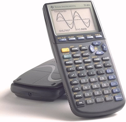
Interface:
That's right, it's the TI-83 Plus that we all use to know and love--most of us anyway. I can still remember the hordes of people who constantly whined about not knowing how to operate it. I can't really blame them though, because it's a pretty complex calculator. There are still things that I know the calculator can do, but I have no idea how to actually do them. The things I did manage to figure out were learned by... reading the manual (let's see you try to find the intersection between two trig functions after just picking it up).
This is a pretty good example of poor mapping. First of all, there is a yellow and green button which are like a "shift" function. Almost every key serves three functions. For example, the x^2 button can be used to square a number, find the square-root of a number (using the yellow button), or to type the letter "I" (using the green button). That is almost acceptable, because everything is at least color-coded and printed by the keys on the calculator.
What if you want to find the factorial of a number? It sounds simple enough, but it's a function that isn't listed on the keys of the calculator. To perform the factorial operation you first have to type in the number. Then you press the "MATH" button. Determining the factorial of a number is a math operation, so it seems to make sense so far. Once selected, a screen with four sub-menus pops up. To select the factorial operation, you have to scroll over to the menu labeled "PRB" (I still don't know what that stands for). Then, you see the menu item "!". Now, this is either the factorial operation you were praying to find, or it's something that is used when typing out "i h8 u ti83, lolz!!1"
Imagine picking up this device for the first time and trying to do this. You'd be better off finding the pdf manual for the TI-83 online and trying to look it up. Who would think to look under a sub-menu labeled "PRB" for it?
Another example of something that isn't very straightforward deals with buttons that serve different purposes in different modes. When accessed from the main screen, the "PRGM" button is used to select programs to run on your calculator; however, it's used for something else when you're writing your own programs. In this case, the button is used to access a list of all the available built-in functions that can inserted into your program (prompt, pause, goto, etc).
Way..wayyyy back in the day, I had tried to type in (letter for letter) an example program from somewhere and couldn't figure out why it wasn't working. After reading the manual, I learned that instead of typing "p-r-o-m-p-t" (which doesn't do anything), you have to select it from the menu using the "PRGM" button... duh.
I thought I was just dumb. As it turns out, I was just another victim of bad design. That's what I tell myself anyway. It was unnatural mappings, feature creep, and other poor design-choices that made this calculator the bane many student's existence.
Comment #1
Comment #2
Comment #3
Interface:
That's right, it's the TI-83 Plus that we all use to know and love--most of us anyway. I can still remember the hordes of people who constantly whined about not knowing how to operate it. I can't really blame them though, because it's a pretty complex calculator. There are still things that I know the calculator can do, but I have no idea how to actually do them. The things I did manage to figure out were learned by... reading the manual (let's see you try to find the intersection between two trig functions after just picking it up).
This is a pretty good example of poor mapping. First of all, there is a yellow and green button which are like a "shift" function. Almost every key serves three functions. For example, the x^2 button can be used to square a number, find the square-root of a number (using the yellow button), or to type the letter "I" (using the green button). That is almost acceptable, because everything is at least color-coded and printed by the keys on the calculator.
What if you want to find the factorial of a number? It sounds simple enough, but it's a function that isn't listed on the keys of the calculator. To perform the factorial operation you first have to type in the number. Then you press the "MATH" button. Determining the factorial of a number is a math operation, so it seems to make sense so far. Once selected, a screen with four sub-menus pops up. To select the factorial operation, you have to scroll over to the menu labeled "PRB" (I still don't know what that stands for). Then, you see the menu item "!". Now, this is either the factorial operation you were praying to find, or it's something that is used when typing out "i h8 u ti83, lolz!!1"
Imagine picking up this device for the first time and trying to do this. You'd be better off finding the pdf manual for the TI-83 online and trying to look it up. Who would think to look under a sub-menu labeled "PRB" for it?
Another example of something that isn't very straightforward deals with buttons that serve different purposes in different modes. When accessed from the main screen, the "PRGM" button is used to select programs to run on your calculator; however, it's used for something else when you're writing your own programs. In this case, the button is used to access a list of all the available built-in functions that can inserted into your program (prompt, pause, goto, etc).
Way..wayyyy back in the day, I had tried to type in (letter for letter) an example program from somewhere and couldn't figure out why it wasn't working. After reading the manual, I learned that instead of typing "p-r-o-m-p-t" (which doesn't do anything), you have to select it from the menu using the "PRGM" button... duh.
I thought I was just dumb. As it turns out, I was just another victim of bad design. That's what I tell myself anyway. It was unnatural mappings, feature creep, and other poor design-choices that made this calculator the bane many student's existence.
First Reading Assignment
Comments:
Comment #1
Comment #2
Comment #3
The Design of Everyday Things
Donald A. Norman
Summary:
This book discusses the importance and different components of "good design." The author writes, "When you have trouble with things... it's not your fault. Don't blame yourself: blame the designer." More often than not, misuse of a product can be attributed to poor design: multi-purpose buttons, doors that should be (not obviously) pulled instead of pushed, ambiguous stove top controls, and the list goes on.
The DOET goes into detail about several different principles that should be considered when designing something:
Discussion:
Having had no previous knowledge of "proper design," there was a lot to learn from this book. We go about our daily lives using tools and devices, and some things are definitely easier to use than others. Instead of saying, "Wow, this is really a piece of junk," I can ask myself what it is about the design that makes the device hard to use. How can this product be changed to improve its usability? These concepts can be used to improve existing designs and make them easier to use. Errors are a part of everyday life. Most of the time, they aren't our fault. Though a good design can't completely eliminate these errors, it can certainly help to minimize their number and severity. Overall, I thought the book was enjoyable; however, it did seem to occasionally repeat itself and jump around between topics.
Quotes:
"There is no need to sacrifice beauty for usability or, for that matter, usability for beauty. No need to sacrifice cost or function, time to manufacture, or sales. It is possible to create things that are both creative and usable, both pleasurable and completely workable. Art and beauty play essential roles in our lives. Good designs will have it all--aesthetic pleasure, art, creativity--and at the same time be usable, workable, and enjoyable."
"Take pride in the little things that help; think kindly of the person who so thoughtfully put them in. Realize that even details matter, that the designer may have had to fight to include something helpful. Give mental prizes to those who practice good design: send flowers. Jeer those who don't: send weeds."
Ranking:
#1- The Design of Everyday Things

Comment #1
Comment #2
Comment #3
The Design of Everyday Things
Donald A. Norman
Summary:
This book discusses the importance and different components of "good design." The author writes, "When you have trouble with things... it's not your fault. Don't blame yourself: blame the designer." More often than not, misuse of a product can be attributed to poor design: multi-purpose buttons, doors that should be (not obviously) pulled instead of pushed, ambiguous stove top controls, and the list goes on.
The DOET goes into detail about several different principles that should be considered when designing something:
- Conceptual Models- users should be able to determine (roughly) how to operate the device by looking at it (scissors, pens, light switches, etc)
- Mappings- there should be a relationship between the controls and their functions. The author calls these, "natural mappings." A light switch should control the lights for the room it is located in and not for lights on the other side of the house. If stove top burners are arranged in a square, the controls should be arranged in a similar manner (not in a line). Cars should travel in the direction that the steering wheel is turned. All of these are examples of good mappings.
- Immediate Feedback- users should know whether the device is functioning or if progress is being made. For example, progress bars are useful when downloading something, because you have an idea of how long the process will take. Without feedback, if you clicked "download" and nothing happened, you would probably click it several more times before giving up. A few hours later when you returned to your computer, you might find your desktop cluttered with 20 copies of "HelloKittyThemeSong.mp3." How embarrassing would that be? The audible "click" and the dialog box that appears are both used by the browser as a form of immediate feedback to the user.
- Visibility- the controls should be visible to the user. Sure, the push-release cabinet without any handles might look nice, but the average person would be unable to open it--if they even knew a cabinet existed there to begin with.
Discussion:
Having had no previous knowledge of "proper design," there was a lot to learn from this book. We go about our daily lives using tools and devices, and some things are definitely easier to use than others. Instead of saying, "Wow, this is really a piece of junk," I can ask myself what it is about the design that makes the device hard to use. How can this product be changed to improve its usability? These concepts can be used to improve existing designs and make them easier to use. Errors are a part of everyday life. Most of the time, they aren't our fault. Though a good design can't completely eliminate these errors, it can certainly help to minimize their number and severity. Overall, I thought the book was enjoyable; however, it did seem to occasionally repeat itself and jump around between topics.
Quotes:
"There is no need to sacrifice beauty for usability or, for that matter, usability for beauty. No need to sacrifice cost or function, time to manufacture, or sales. It is possible to create things that are both creative and usable, both pleasurable and completely workable. Art and beauty play essential roles in our lives. Good designs will have it all--aesthetic pleasure, art, creativity--and at the same time be usable, workable, and enjoyable."
"Take pride in the little things that help; think kindly of the person who so thoughtfully put them in. Realize that even details matter, that the designer may have had to fight to include something helpful. Give mental prizes to those who practice good design: send flowers. Jeer those who don't: send weeds."
Ranking:
#1- The Design of Everyday Things
Subscribe to:
Posts (Atom)