Wednesday, January 28, 2009

TI-83 Interface

Comments:
Comment #1
Comment #2
Comment #3

Interface:
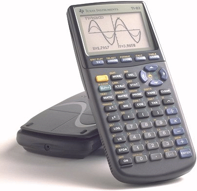
That's right, it's the TI-83 Plus that we all use to know and love--most of us anyway. I can still remember the hordes of people who constantly whined about not knowing how to operate it. I can't really blame them though, because it's a pretty complex calculator. There are still things that I know the calculator can do, but I have no idea how to actually do them. The things I did manage to figure out were learned by... reading the manual (let's see you try to find the intersection between two trig functions after just picking it up).

This is a pretty good example of poor mapping. First of all, there is a yellow and green button which are like a "shift" function. Almost every key serves three functions. For example, the x^2 button can be used to square a number, find the square-root of a number (using the yellow button), or to type the letter "I" (using the green button). That is almost acceptable, because everything is at least color-coded and printed by the keys on the calculator.

What if you want to find the factorial of a number? It sounds simple enough, but it's a function that isn't listed on the keys of the calculator. To perform the factorial operation you first have to type in the number. Then you press the "MATH" button. Determining the factorial of a number is a math operation, so it seems to make sense so far. Once selected, a screen with four sub-menus pops up. To select the factorial operation, you have to scroll over to the menu labeled "PRB" (I still don't know what that stands for). Then, you see the menu item "!". Now, this is either the factorial operation you were praying to find, or it's something that is used when typing out "i h8 u ti83, lolz!!1"

Imagine picking up this device for the first time and trying to do this. You'd be better off finding the pdf manual for the TI-83 online and trying to look it up. Who would think to look under a sub-menu labeled "PRB" for it?

Another example of something that isn't very straightforward deals with buttons that serve different purposes in different modes. When accessed from the main screen, the "PRGM" button is used to select programs to run on your calculator; however, it's used for something else when you're writing your own programs. In this case, the button is used to access a list of all the available built-in functions that can inserted into your program (prompt, pause, goto, etc).

Way..wayyyy back in the day, I had tried to type in (letter for letter) an example program from somewhere and couldn't figure out why it wasn't working. After reading the manual, I learned that instead of typing "p-r-o-m-p-t" (which doesn't do anything), you have to select it from the menu using the "PRGM" button... duh.

I thought I was just dumb. As it turns out, I was just another victim of bad design. That's what I tell myself anyway. It was unnatural mappings, feature creep, and other poor design-choices that made this calculator the bane many student's existence.

First Reading Assignment

Comments:
Comment #1
Comment #2
Comment #3

The Design of Everyday Things
Donald A. Norman

Summary:
This book discusses the importance and different components of "good design." The author writes, "When you have trouble with things... it's not your fault. Don't blame yourself: blame the designer." More often than not, misuse of a product can be attributed to poor design: multi-purpose buttons, doors that should be (not obviously) pulled instead of pushed, ambiguous stove top controls, and the list goes on.

The DOET goes into detail about several different principles that should be considered when designing something:
  • Conceptual Models- users should be able to determine (roughly) how to operate the device by looking at it (scissors, pens, light switches, etc)
  • Mappings- there should be a relationship between the controls and their functions. The author calls these, "natural mappings." A light switch should control the lights for the room it is located in and not for lights on the other side of the house. If stove top burners are arranged in a square, the controls should be arranged in a similar manner (not in a line). Cars should travel in the direction that the steering wheel is turned. All of these are examples of good mappings.
  • Immediate Feedback- users should know whether the device is functioning or if progress is being made. For example, progress bars are useful when downloading something, because you have an idea of how long the process will take. Without feedback, if you clicked "download" and nothing happened, you would probably click it several more times before giving up. A few hours later when you returned to your computer, you might find your desktop cluttered with 20 copies of "HelloKittyThemeSong.mp3." How embarrassing would that be? The audible "click" and the dialog box that appears are both used by the browser as a form of immediate feedback to the user.
  • Visibility- the controls should be visible to the user. Sure, the push-release cabinet without any handles might look nice, but the average person would be unable to open it--if they even knew a cabinet existed there to begin with.
These are some of the basic principles the author considers essential to any good design.

Discussion:
Having had no previous knowledge of "proper design," there was a lot to learn from this book. We go about our daily lives using tools and devices, and some things are definitely easier to use than others. Instead of saying, "Wow, this is really a piece of junk," I can ask myself what it is about the design that makes the device hard to use. How can this product be changed to improve its usability? These concepts can be used to improve existing designs and make them easier to use. Errors are a part of everyday life. Most of the time, they aren't our fault. Though a good design can't completely eliminate these errors, it can certainly help to minimize their number and severity. Overall, I thought the book was enjoyable; however, it did seem to occasionally repeat itself and jump around between topics.

Quotes:
"There is no need to sacrifice beauty for usability or, for that matter, usability for beauty. No need to sacrifice cost or function, time to manufacture, or sales. It is possible to create things that are both creative and usable, both pleasurable and completely workable. Art and beauty play essential roles in our lives. Good designs will have it all--aesthetic pleasure, art, creativity--and at the same time be usable, workable, and enjoyable."

"Take pride in the little things that help; think kindly of the person who so thoughtfully put them in. Realize that even details matter, that the designer may have had to fight to include something helpful. Give mental prizes to those who practice good design: send flowers. Jeer those who don't: send weeds."

Ranking:
#1- The Design of Everyday Things